bookmark_borderCopernicus Scroll Illustration

Back before Pennsic, I was contacted by our local group’s “Signet” (person in charge of organizing scribes and illuminators to make award scrolls) about illustrating an award scroll for my Sweetie. She was receiving the highest award for service that our Barony gives, so I knew it had to be something she would really enjoy. That meant irises.

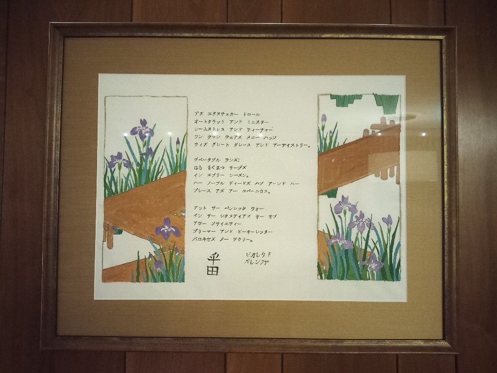
Traced from an image in Beyond Golden Clouds (Yale University Press, 2009), edited by Janice Katz, page 153. The original is a two-panel “oshie-bari byobu” painted screen, roughly 52” tall. The Sakai family owned several paintings by Ogata Korin, and Hoitsu seeks to imitate his master’s style here in a screen titled “Irises and Eight-fold Bridge”. The original screen uses a background of gold leaf squares to create the illusion of golden sunlight reflecting off the surface of the water. Irises take significant tending, but the work results in a multiplication of blooms over time. I chose to leave the background of this copy blank to suggest that there is always work left to be done.

I did a practice copy on some of my regular (affordable) hosho paper, then did this fair copy on a large piece of kozo paper. Sweetie loves it so much that she had it framed for display in her den.

bookmark_borderPennsic Gate Panels

Last year, I made a new entry gate for the Debatable Lands Pennsic camp. Part of the design was for two panels, made from 6-foot 1-by-10 lumber, that are basically decorative and not structural. The idea was to use them as message boards that could be repainted every year or so depending on what people wanted to say. Last year, they honored 50 years of the Debatable Lands. (Because you can’t spell “Debatable Lands” without “L ans“.) This year I wanted them to honor Pennsic 52. (Now playing with a full deck!)

I bought two 1x10x72 boards at the orange DIY store and sanded them smooth. Last year I rounded-over the edges, but this year I did not bother. Then, I applied sanding sealer to harden the wood and sanded it (after drying) to create a nice smooth surface for painting. I did the “calligraphy” and playing-card “illustration” mostly by hand using enamel paint. The white rounded rectangles were taped off to make it easier to keep the edges crisp. rather than get too twitchy about making identical card backs, I just taped margins on the rectangles and kind of swiped the black and red brushes across. Most people seemed to understand what I was going for.

Anyway, these went over well and as a bonus, I can use the cards again next year since it’s 52 years as a Barony!

bookmark_borderMore Pelican Brushwork

I just realized that I never posted about the first set of pelican brushwork, but here is the second set of pelican images. The story here is that the “Order of the Pelican” is the SCA peerage order, much like a Knighthood is for fighting, but for service to the society. I saw a terrific photograph of a pelican in a page about “best wildlife photographs of 2021”, and I realized that the image would make a great Yamato-e scroll blank. Maybe not for a peerage, but maybe for a “writ”, an invitation to consider entry into the order. I thought that image came out OK, but I hunted down another image because I wanted one in flight …and here it is!

Pelican 02 01
Pelican 02 02
Pelican 02 03

My paintings are derived from a photograph posted to Awesome Sasquatch in 2013 by Ken Chan. All credit, any vibrancy and splendor in my image is entirely based on his image.

bookmark_borderGiant Squid Brushwork

Choju squiga? A few weeks ago, there was a news story about a town in Japan that is attempting to kickstart tourism after the pandemic by installing a statue of a giant squid. Awesome, huh? I wanted to be able to use the image of the giant squid for my own purposes (porpoises?), so a quick trip to the paintbox later…

Giant Squid (01)
Giant Squid (02)

I’m happier with the tentacles on the second one, but I’m not completely happy with the shading on it.

bookmark_borderPhoto-tracing Brushwork

I want to get better at creating traditional-looking artwork from photographs. I had a couple of photos from our trip to Japan for the 2019 braiding conference, so I decided to try tracing them and making some Sesshu-inspired scroll blanks.

Duck Pond (01)

This first one is actually a composite of two photos. I had one photo of the ducks, and another of the distant shore of the pond. I combined these to create a little bit of perspective. I’m really happy with the way this one turned out. The ducks are attractive, and I was able to show the reflection of the shoreline in the water nicely.

Turtle Rock (01)

I’m somewhat less happy with this one. The turtle and the rock just are not very interesting, and the rocky shoreline at the top is just a bunch of gray blobs. Maybe with some color it could be nice, but maybe not. They can’t all be winners.

Bird Tree (01)

I tried doing this one as a gray wash only artwork, but the tree came out looking like a big gray blob on a stick, so I added a myriad of little daubs in four different colors of green. I kind of like it now. The bird is very visible.

I should note that I have expanded my “SCA Emaki” page to include most of my more recent explorations of Yamato-e brushwork.