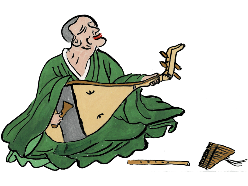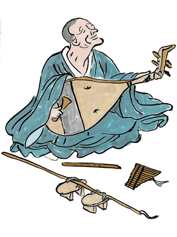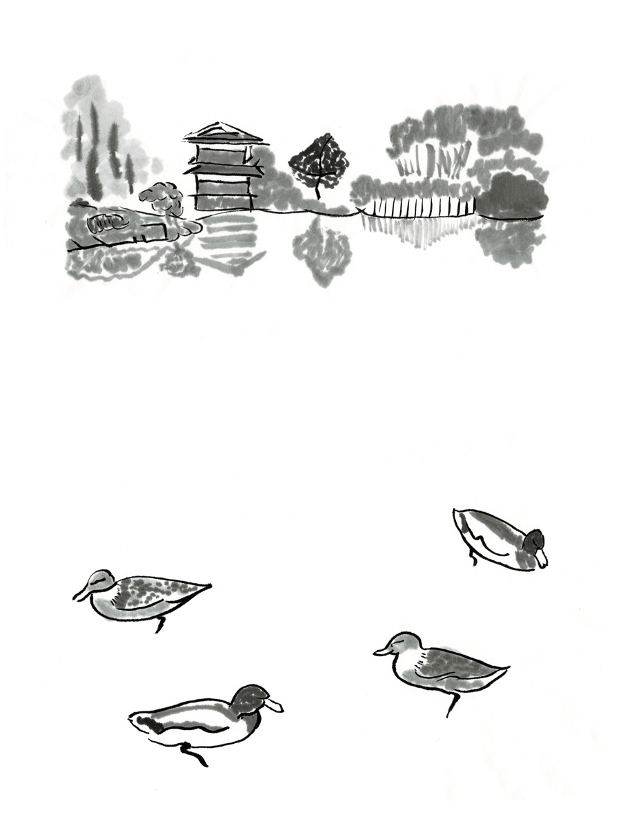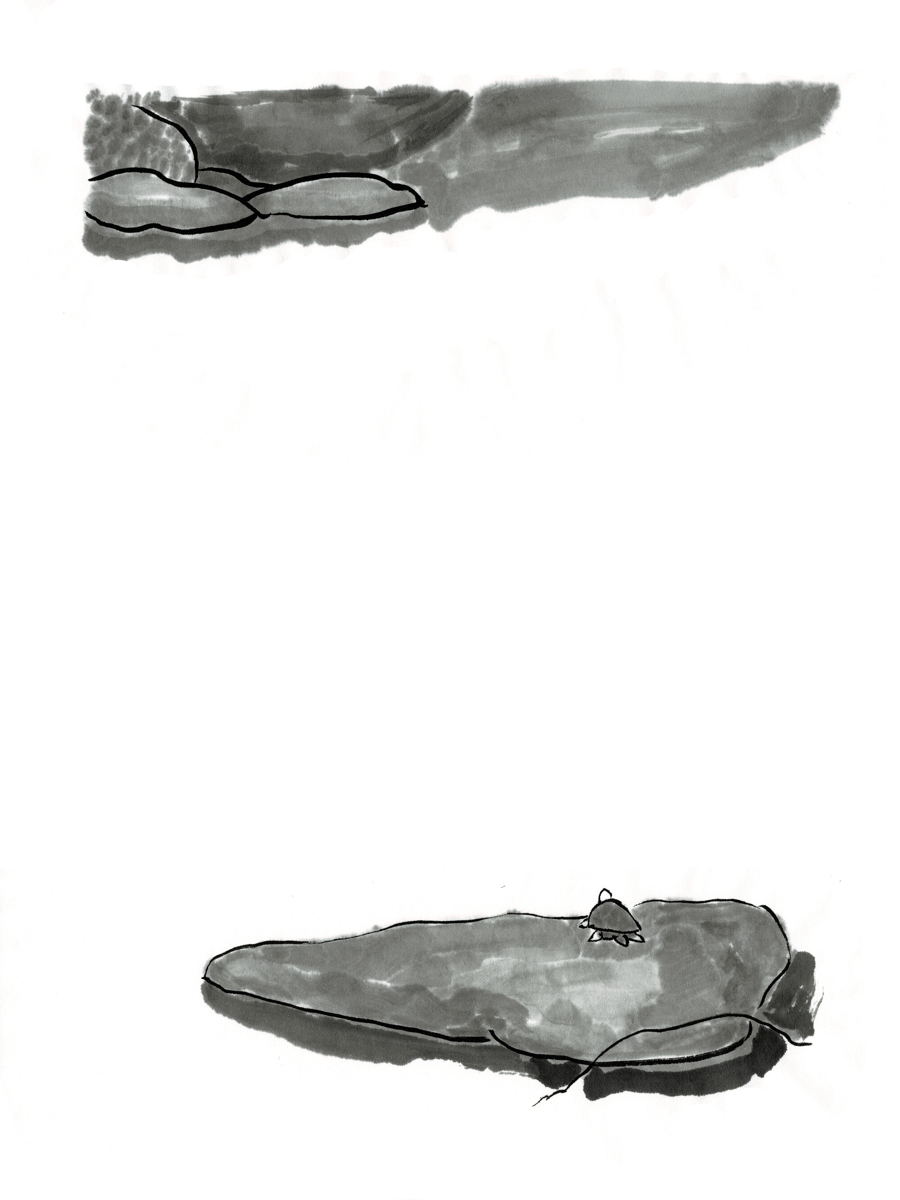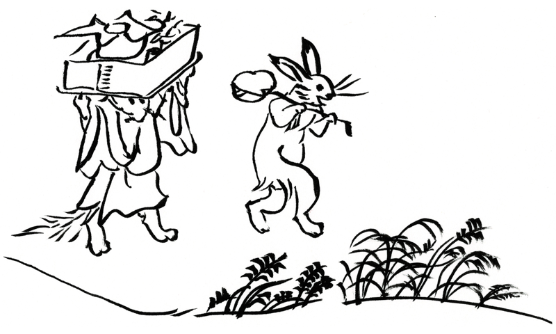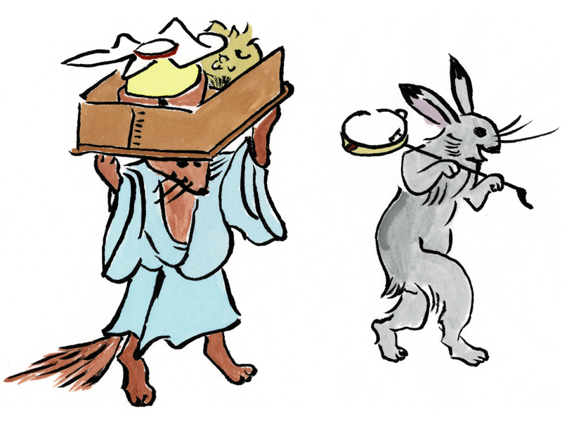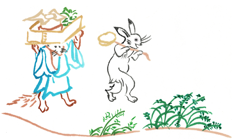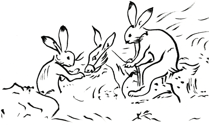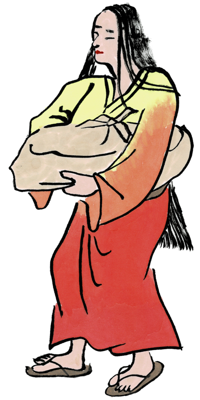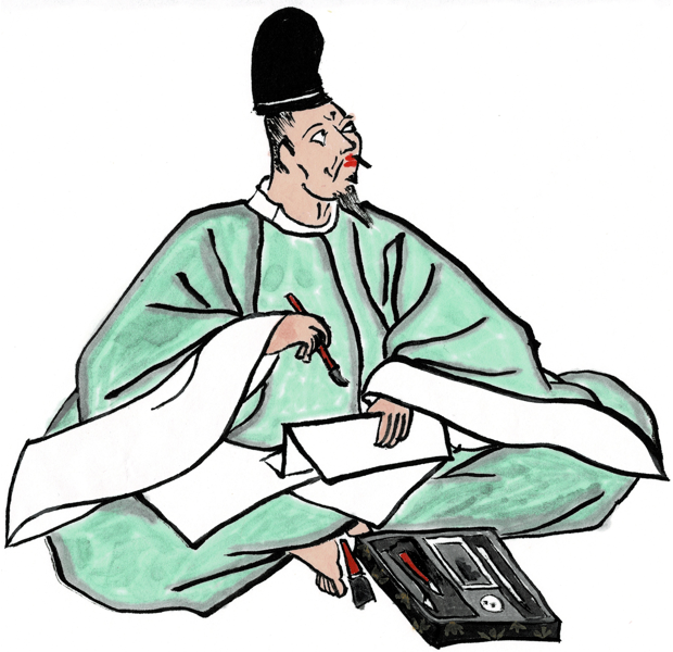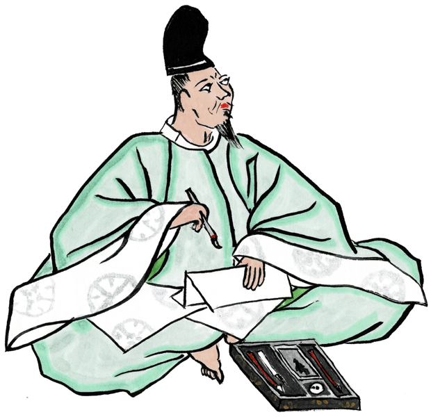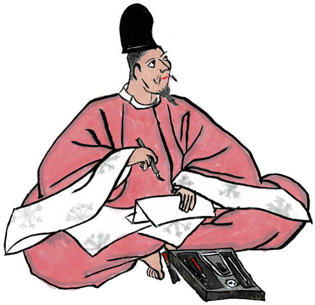
I have done a few custom award scroll illustrations for people in recent years, but I have also kept my hand in the “scroll blank” game. For those not following along at home, if a scroll is needed quickly and there’s no time for a custom illustration, a scribe can just write in the words on one of these pre-illustrated pieces of paper. They are fun to create, and it’s nice to be able to provide these to the Barony especially.
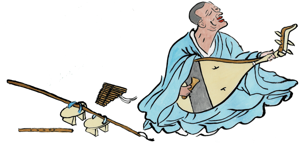
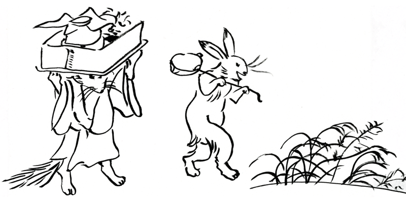
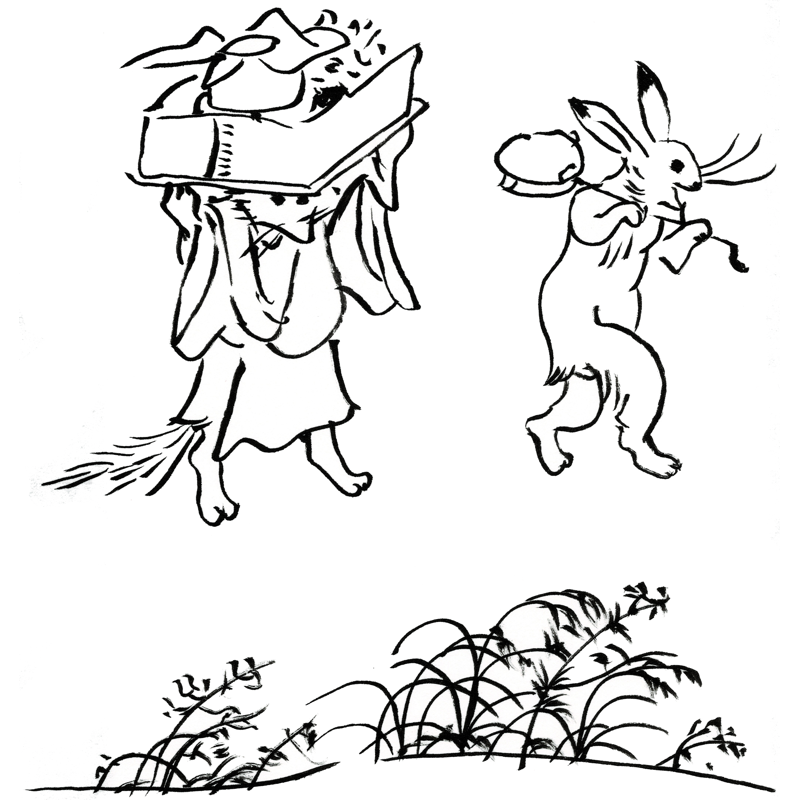
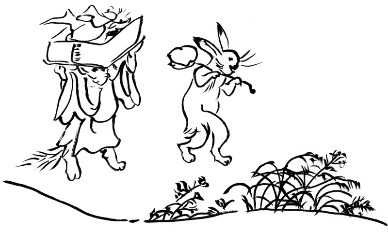
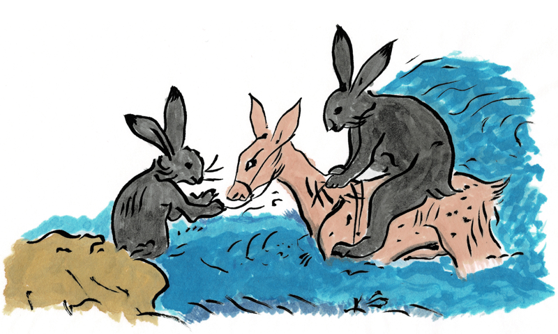
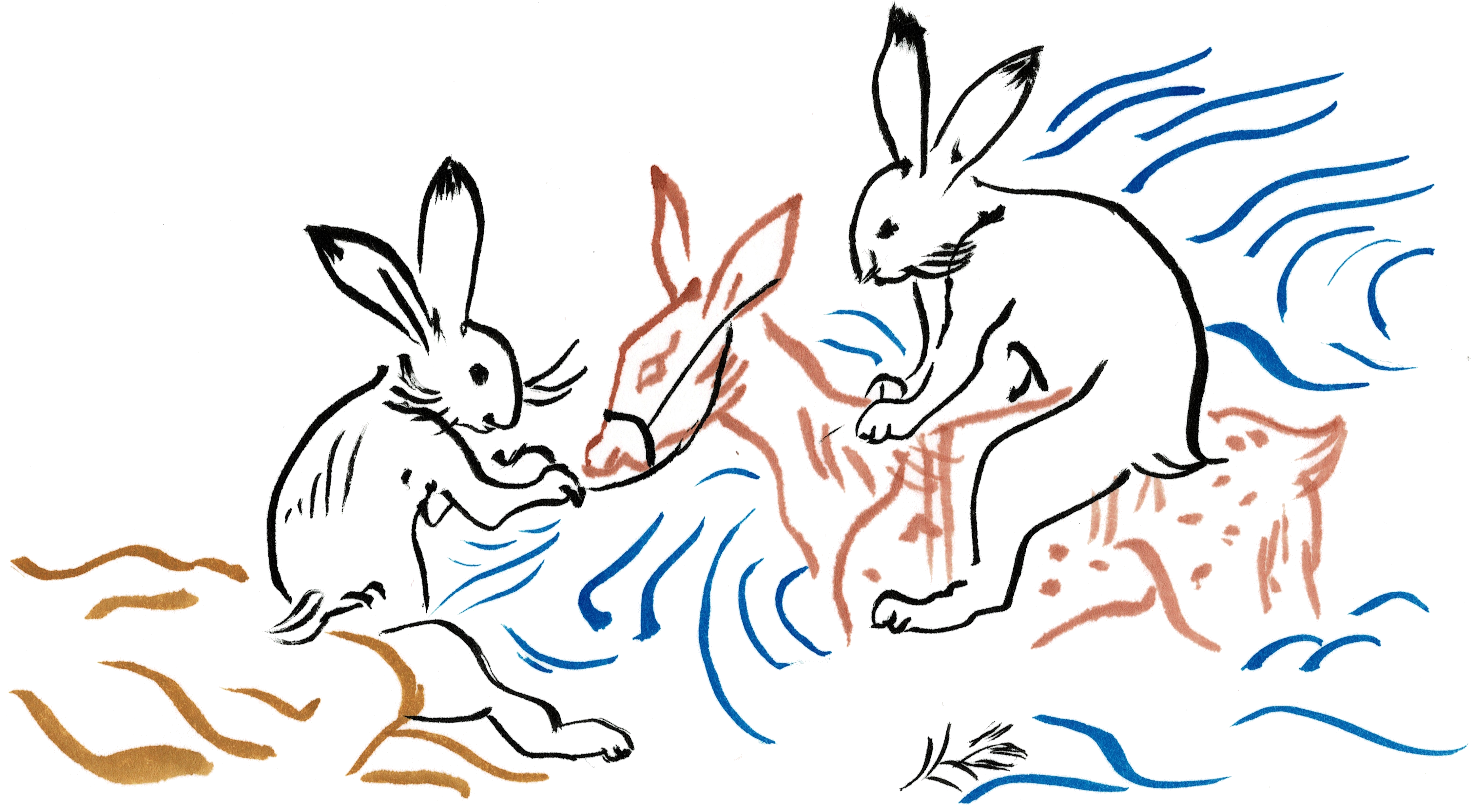
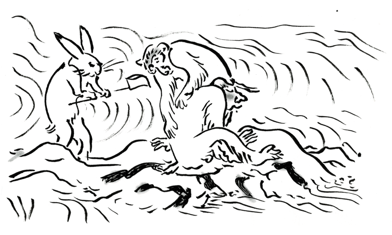
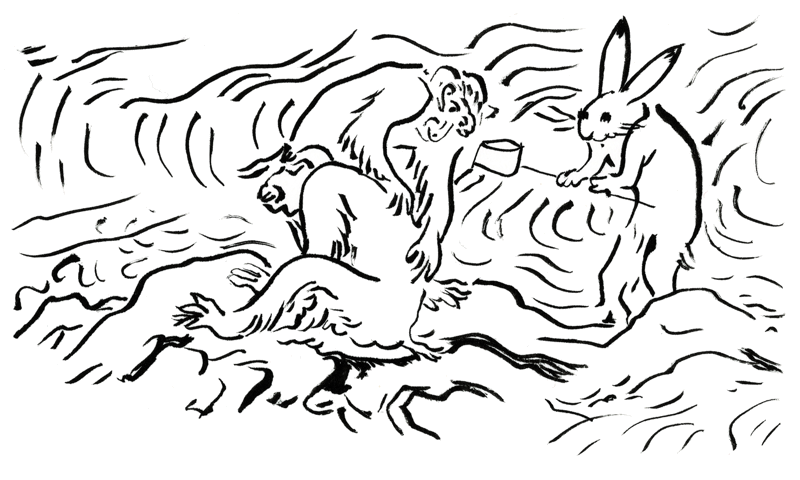
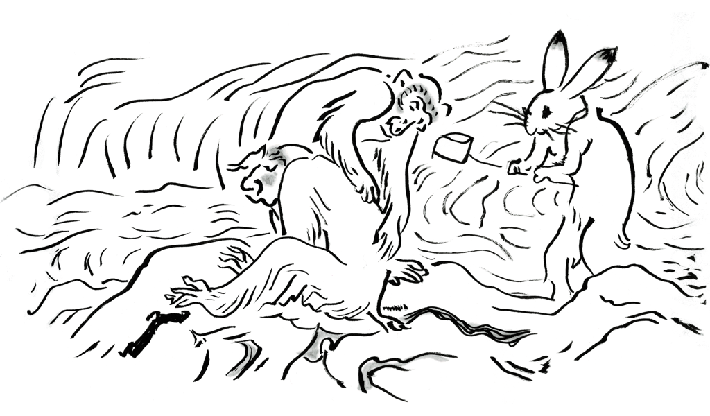
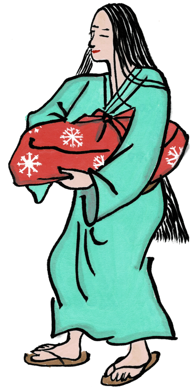
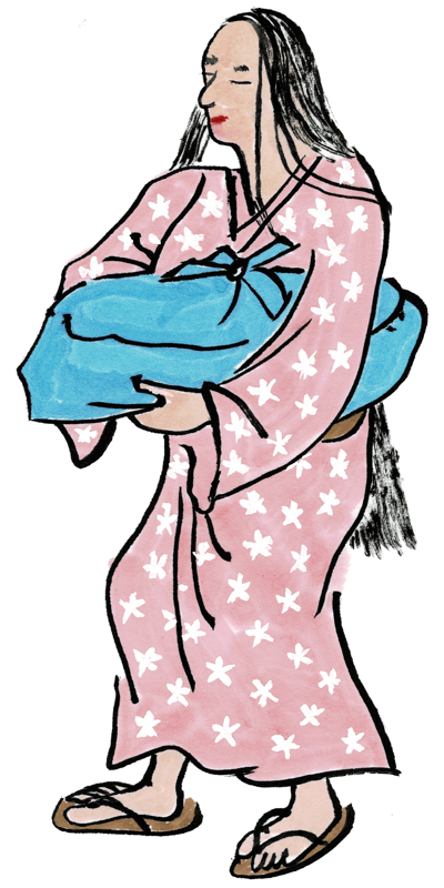
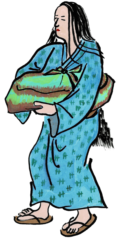
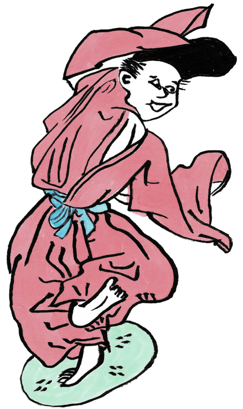
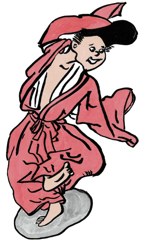
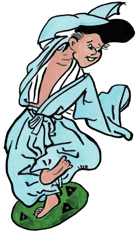
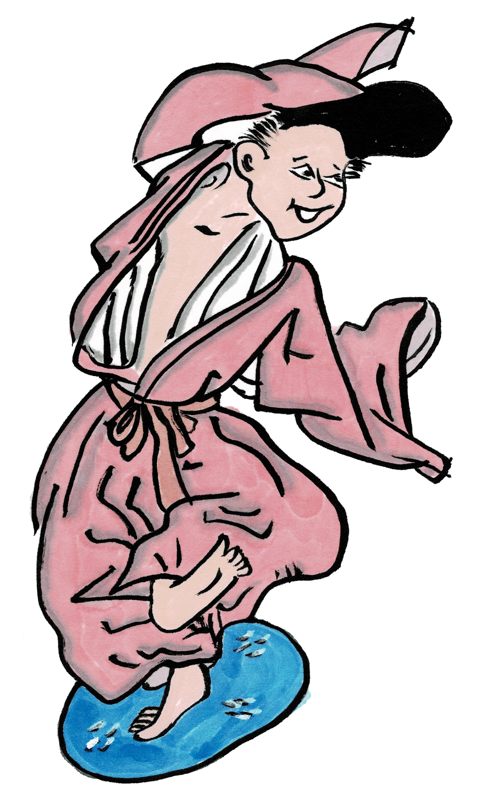
Anyway, it’s been a few years since I added images and text to my Yamato-e catalog here on the site. This has now been corrected. Below are some of my favorites from the new stuff.
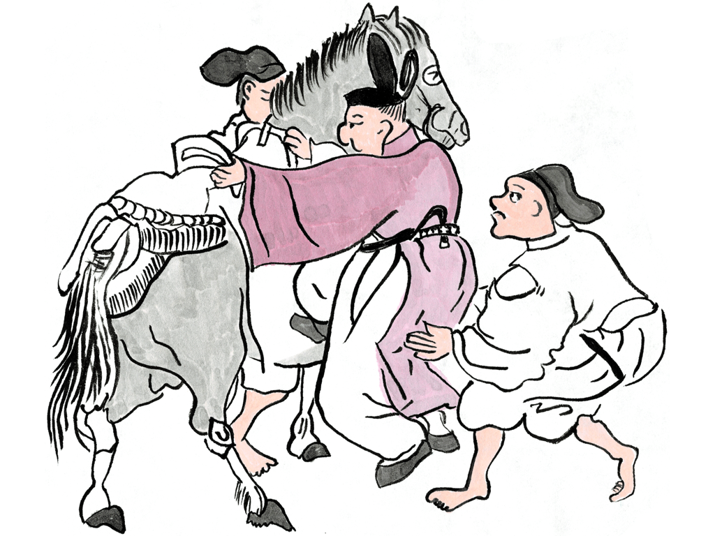
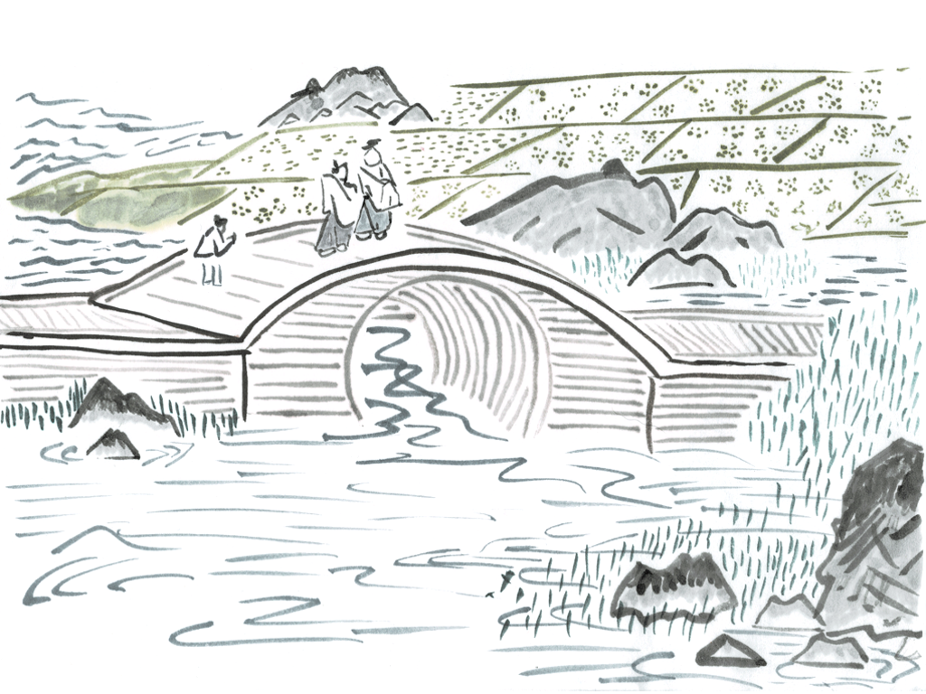
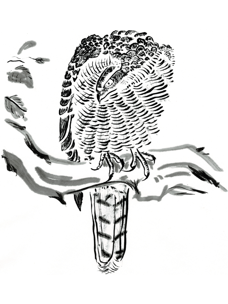
For more information on the sources and original artists of these images, please see my updated Yamato-e page.