bookmark_borderDiseased Brushwork

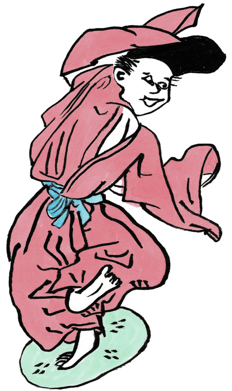
The paintings are not actually diseased, of course. The original scroll is called the Yamai no Soshi emaki, which is “Scroll of Diseases and Afflictions”. This is a pretty unpleasant scroll overall, but there are some nice details. I particularly like this image of a calm maidservant carrying her mistress’ burden.

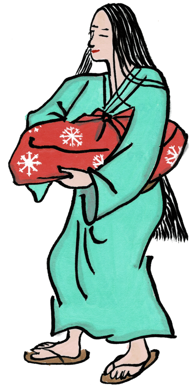
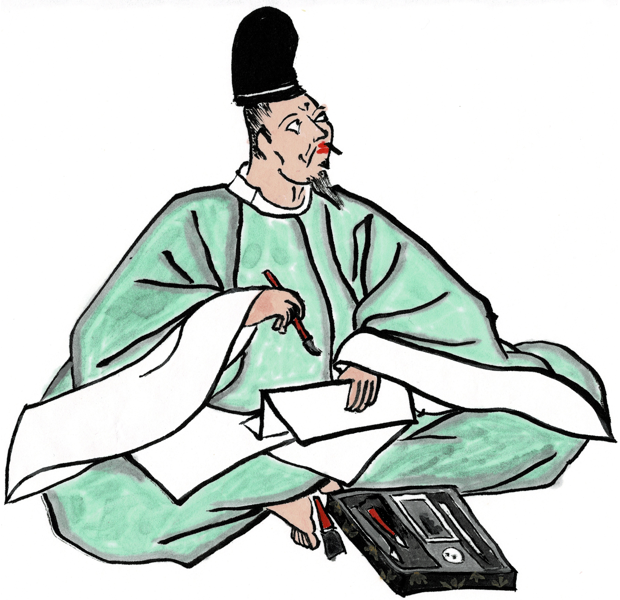
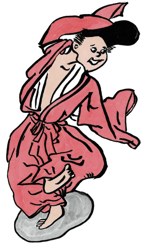
I’m clearly back into the swing of painting by now. The inking is smooth, the color is even, and the shading is good. I even put little escarbuncles on the package.

One of my favorite comic books is Usagi Yojimbo by Stan Sakai. Even when he’s working in black and white, he usually adds graphic interest to the clothing of characters by embellishing the fabric with repeating graphics. I decided to use this effect, adding little cherry blossoms to the maid’s kosode.

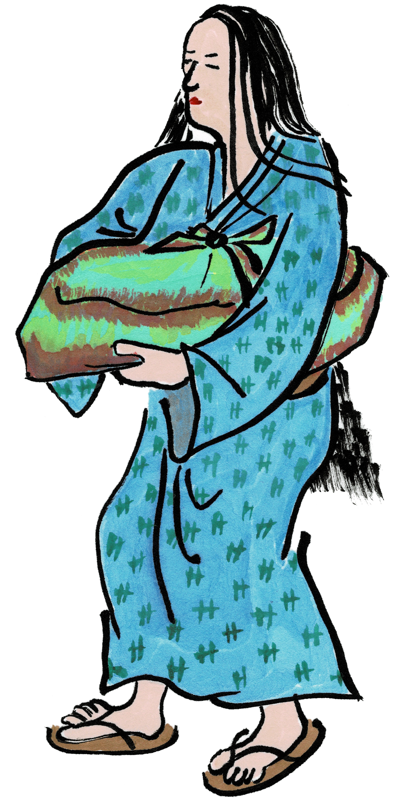
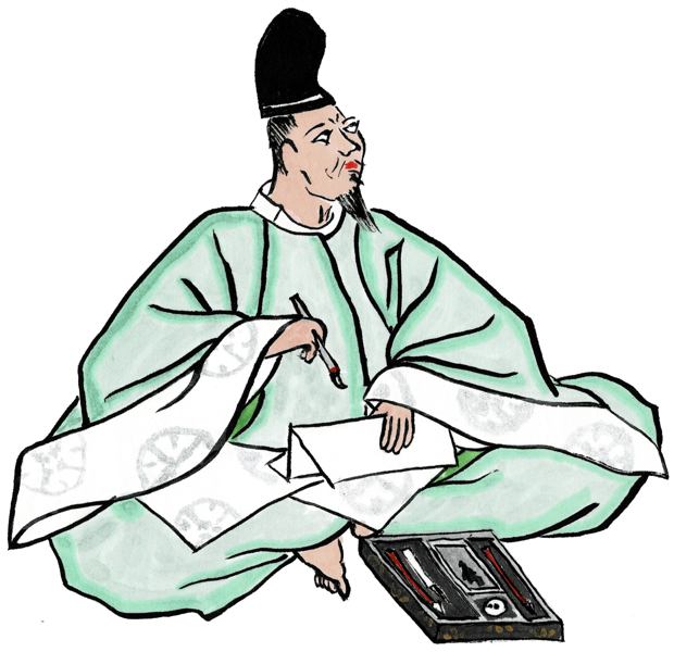
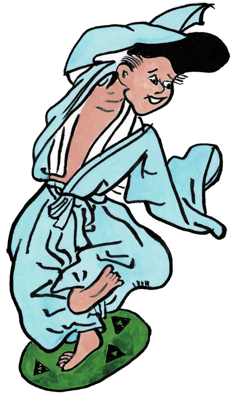
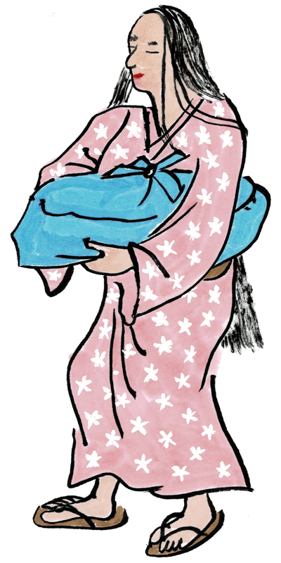
Here I added little ikat patterns to the kosode, and gave the package a tie-dye coloring. This started when some of the blue from the robe ran over into the wrapping cloth, then I tried to cover it up with some red, which just made it look like whatever was in the package was leaking blood. So, I had to do still more work.

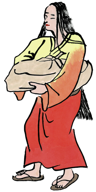
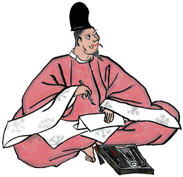
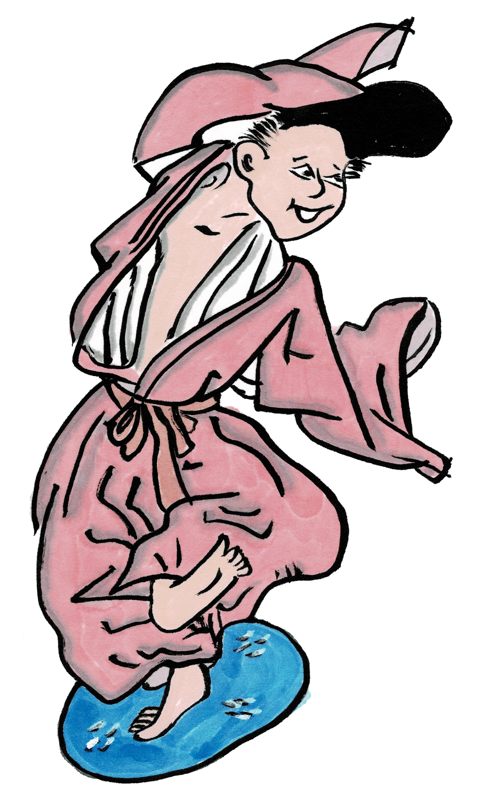
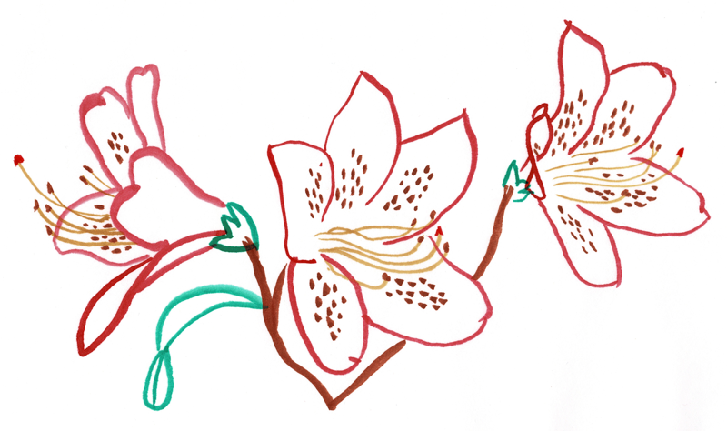
This one got a reasonably smooth gradient coloring, made by mixing up some yellow paint, then adding orange, then adding red. I’m happy with how this turned out. The coloring is pretty smooth, too.

bookmark_border36 Immortals Brushwork

When Sharon and I went to Iga, Japan for the braiding conference in 2019, after the conference was over we spent a few days in Kyoto to see the sights. One of those days we walked over to the Kyoto National Museum. They were having an exhibition of most of the panels that used to be part of the Satake family version of the “36 Immortal Poets” scroll. this scroll was infamously broken up into individual hanging scrolls about a hundred years ago, and this was the most complete exhibition since that time.

Since I knew that eventually I would want to get back into scroll painting, I bought the book of the exhibit. This is first of my copies from this book, a portrait of Yamabe no Akihito. He is considered to be a poet only slightly less great than the famous Hitomaro.

This one is OK, but not great. The coloring is uneven and the shading is not very good. The original has terrific shading. I wish I’d thought about all the little details in his writing box (suzuribako) before I got started.

This one is much better. The coloring is almost completely even, and the shading is great. I even added the “medallions” to his hitoe underlayer that are visible in the original. Although, I seem to have forgotten the brush next to his foot.

This one I colored in red, and made the medallions into escarbuncles in honor of my home kingdom of Aethelmearc. The coloring and shading are good, and I like the way the escarbuncles came out.

bookmark_borderRedux of the Brushwork

When I started tracing emaki images for scroll blanks, the very first one I did was from the Eshi Zoshi emaki. This emaki recounts the rise and fall of a young poet appointed to the court. I decided to do some “back to the well” blanks as part of my current work, just to see if I’d gotten any better over time.

The outlines are good, but clearly, I had forgotten everything I ever learned about coloring this image. This one went straight into the “scrap” folder as soon as the paint was dry.

That’s better.

This one’s OK, although the skin tone came out a bit dark. I added some Hojo mon to the zabuton pillow for some reason.

Now I’m back in the swing of things! Good inking, good coloring, and I even added some light shading to give it a bit more dimensionality and texture. I’m pretty happy with this one.

bookmark_borderHey, it’s Brushwork

Sometimes, you just have to go back to basics and see if you’ve actually improved or just think so. I pulled this figure detail from the Heiji Monogatari, which details a series of civil wars in ancient Japan between the Heike and Genji clans.

This one, I just gave a light ink wash to his robe. (Plus a little detail color on his arrow fletching.) Hey, that looks all right.

This one, I used light color washes on his clothing, and a bit of peach pink on his flesh. At some point, I flipped this image left-to-right in my library. His sword is on the wrong side.

One more with watercolor washes. Maybe I can actually learn how to do this? If the outline for the soldier looks a little crude, he is fairly small in the original scroll, and I only have a very bad black+white image in my reference. These images will make good scroll for minor archery recognition, I hope.

bookmark_borderMore Brushwork

Next, I decided to copy another image from Sesshu‘s “Long Scroll of Landscapes”. Sesshu is one of my favorites, and I bought book about the Long Scroll when I visited the Tokyo National Museum during my first trip to Japan (for the TV show) in 2016. They have an excellent bookstore in the TNM, but I knew that I didn’t have a lot of room for books flying back, so I just bought this one. Anyway, the copies:

This first one is done primary with black ink lines, then some shading in paint (mostly gray) to simulate the light ink washes that Sesshu was great at and I am not.

For this one, I added a little bit of color, mostly from my smaller set of sumi watercolors. I’ve done this kind of thing before, and I really like the effect this produces. It’s less traditional than the pure ink style that Sesshu used, but I like it anyway.

For this last one, I used entirely paint and no ink. Even the black lines a re black paint instead of ink. I was trying out some of the color variations in my larger set of sumi watercolors, some of which I had never used before. The overall effect is a little impressionistic, but I like the way some of the background washes came out.

bookmark_borderPicking Up the Brush

I was recently inspired to start painting SCA scroll blanks again, like I did (gulp!) six years ago. My first recent efforts were these, traced from a photo I took of some Azalea blooms in Sharon’s garden.

Original images are all about 8.5″x5.5″ in size. These are all done with Sumi ink and watercolors on 9″x12″ hosho paper. I’m still in love with my “Kolinsky small” brush from Kuretake. Preserve the kolinsky!

The third picture is probably the least “medieval Japanese” of all these, but I think it’s the most attractive. It is difficult to get good shading and depth in watercolor, and I’m just not good enough yet. The outline form is a little easier to achieve.