bookmark_borderSuprematist Composition #01

Suprematism was an early twentieth century art movement that started in post-revolutionary Russia, and embodied the idea that humanity had to free itself from the past and move boldly into the future with new concepts of everything, including art. My personal attachment to Suprematism dates back just a few years to when my Aunt found a book about the city of Vitebsk.

In the early Soviet era, Vitebsk became a city-wide art colony. The Suprematist school was one of the largest and most influential schools of art in Vitebsk at that time. On one page of the book, there is a full-page photo of a delegation of artists from Vitebsk who are traveling to Moscow to lobby the government for increased arts funding. Right in the front of the crowd is a person who looks like he is a relative of mine, and the caption of the photo identifies him as having the same family name as my maternal grandmother. My guess is that he was probably a cousin of hers.

So anyway, that is the origin of my preoccupation with the Suprematist movement. There is way more to know about Suprematism than I am willing to include in this post. The nutshell version is that the Suprematists believed in the supremacy of geometric forms and subjective emotion over the functional objectivity of representational art. The most iconic painting is by Kazimir Malevich the founder of the Suprematist school, and it shows a large black square occupying the center of a square white canvas.

A couple of weeks ago, my mind presented me with an image that I recognized as a Suprematist composition. This image popped up daily from then on. From previous experiences with this kind of mental obsession I knew that only bringing this urge to physical form would get it out of my head. Yesterday, I finally walked to the art store, bought a canvas, and made it into an actual painting.

Five Black Bars (2026, Acrylic and Canvas, 14 in. by 14 in.)

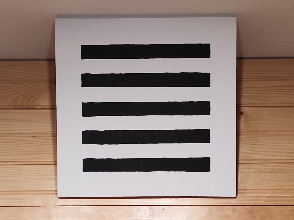
There it is, displayed in my home office as Malevich displayed his painting Black Square. It is one of the few projects I have ever produced that is a genuine attempt at artistic expression. You are, of course, entitled to your own opinions on “modern art” or my own clumsy execution. The composition was laid out by hand with ruler and pencil, and the paint applied to canvas by hand with brushes. This is not a joke of any kind. This composition has meaning to me, and this work has personal resonance.

A common criticism of abstract art is, “A child could have done this.” In this case at least I disagree. Not only was this work technically difficult to compose (Can you divide ten by nine using a ruler?) it relied on lengthy experience with brushes and paint to execute. A child who could do this should be sent to art school, engineering school, or both. Another criticism is, “I could have done this.” Again I disagree, because you did not. You did not have the combination of knowledge, emotion, history, experience, and desire that demanded the creation of this painting. If you have the basic skills necessary to replicate this painting (and I have no doubt that many of you who bother to read this far can exceed any rudimentary skills I have with paint) then by all means do so. If my painting inspires you to make your own painting in response, then I encourage — actually, I demand — that you do so. Even if your painting looks just like mine it will still be yours. Your painting will not be my painting.

I look forward to seeing your painting.

bookmark_borderSycamore Medallions

In our SCA Kingdom, the basic level award for arts and research is called the Order of the Sycamore. Almost all of the trees that line our street (Shady Avenue) here in Pittsburgh are sycamores, and they shed branches all the time. When life gives you sycamore, make sycamade! Er, madellions. I mean, medallions!

I had a sycamore branch that had come down in the street in front of the house, and that I had cut up into 2-foot lengths. They’ve been drying in the garage for a couple of years, and it was time to do something with them. I cut a stack of “cookies” from one of the branches, and sanded both side of them smooth. Then, I dipped them in sanding sealer, let that dry, and sanded them even smoother. (somewhere in there I drilled them to accept a jump ring for hanging. Next, I painted the badge of the order on each cookie, and sealed the paint with a couple of coats of shellac. (Did you know that “gum arabic”, the binding agent in water paints, is not soluble in alcohol, the solvent in shellac?). Finally, I braided six cords on the marudai and hung each medallion from a cord.

The medallions themselves. Actually, this was from before the shellac
The medallions attached to cords

Sycamore medallions… made from real sycamore!

bookmark_borderCopernicus Scroll Illustration

Back before Pennsic, I was contacted by our local group’s “Signet” (person in charge of organizing scribes and illuminators to make award scrolls) about illustrating an award scroll for my Sweetie. She was receiving the highest award for service that our Barony gives, so I knew it had to be something she would really enjoy. That meant irises.

Traced from an image in Beyond Golden Clouds (Yale University Press, 2009), edited by Janice Katz, page 153. The original is a two-panel “oshie-bari byobu” painted screen, roughly 52” tall. The Sakai family owned several paintings by Ogata Korin, and Hoitsu seeks to imitate his master’s style here in a screen titled “Irises and Eight-fold Bridge”. The original screen uses a background of gold leaf squares to create the illusion of golden sunlight reflecting off the surface of the water. Irises take significant tending, but the work results in a multiplication of blooms over time. I chose to leave the background of this copy blank to suggest that there is always work left to be done.

I did a practice copy on some of my regular (affordable) hosho paper, then did this fair copy on a large piece of kozo paper. Sweetie loves it so much that she had it framed for display in her den.

bookmark_borderArtisanal Brushwork Five

This is the second of a pair of recent replications of images from the Nanajuichiban Shokunin Uta-awase emaki, a medieval Japanese scroll that depicts an imaginary poetry competition between artisans and artists of various types.

Nanjuichiban Taiko Shokunin 01

This emaki (illustrated scroll) depicts a poetry competition (uta-awase) among people of various occupations. The competition has 71 rounds, and 142 different kinds of craftspeople (shokunin) are depicted, each with their own poem. This image depicts a musician playing a small drum called a “ko-tzuzumi”, The heads of the drum are tensioned with rope. As she is depicted with a walking stick and zori sandals, she is most likely an itinerant musician.

Nanjuichiban Taiko Shokunin 02

I’m happier with the second copy, though realistic depictis of the drum appear to be somewhat beyond me. I’m intrigued by the thing where both this lady and the biwa player thread the walking stick through the straps of their sandals.

[Ishiyama‘s Yamato-e page has been updated to include all the paintings to date.]

bookmark_borderArtisanal Brushwork Four

This is the first of a pair of recent replications of images from the Nanajuichiban Shokunin Uta-awase emaki, a medieval Japanese scroll that depicts an imaginary poetry competition between artisans and artists of various types.

Nanjuichiban Biwa Shokunin 01

This emaki (illustrated scroll) depicts a poetry competition (uta-awase) among people of various occupations. The competition has 71 rounds, and 142 different kinds of craftspeople (shokunin) are depicted, each with their own poem. This image depicts a musician playing a stringed instrument called a “Biwa”, the strings are plucked with a fan-shaped plectrum. As he is depicted with a walking stick and geta sandals, he is most likely an itinerant musician.

Nanjuichiban Biwa Shokunin 02

You can see that I did a little bit of playing with color and composition, particularly the arrangement of the musician’s accoutrement. The first one is most true to the original scroll, but I like the way the green coloring came out on the second copy.

bookmark_borderMore Pelican Brushwork

I just realized that I never posted about the first set of pelican brushwork, but here is the second set of pelican images. The story here is that the “Order of the Pelican” is the SCA peerage order, much like a Knighthood is for fighting, but for service to the society. I saw a terrific photograph of a pelican in a page about “best wildlife photographs of 2021”, and I realized that the image would make a great Yamato-e scroll blank. Maybe not for a peerage, but maybe for a “writ”, an invitation to consider entry into the order. I thought that image came out OK, but I hunted down another image because I wanted one in flight …and here it is!

Pelican 02 01
Pelican 02 02
Pelican 02 03

My paintings are derived from a photograph posted to Awesome Sasquatch in 2013 by Ken Chan. All credit, any vibrancy and splendor in my image is entirely based on his image.

bookmark_borderGiant Squid Brushwork

Choju squiga? A few weeks ago, there was a news story about a town in Japan that is attempting to kickstart tourism after the pandemic by installing a statue of a giant squid. Awesome, huh? I wanted to be able to use the image of the giant squid for my own purposes (porpoises?), so a quick trip to the paintbox later…

Giant Squid (01)
Giant Squid (02)

I’m happier with the tentacles on the second one, but I’m not completely happy with the shading on it.

bookmark_borderPhoto-tracing Brushwork

I want to get better at creating traditional-looking artwork from photographs. I had a couple of photos from our trip to Japan for the 2019 braiding conference, so I decided to try tracing them and making some Sesshu-inspired scroll blanks.

Duck Pond (01)

This first one is actually a composite of two photos. I had one photo of the ducks, and another of the distant shore of the pond. I combined these to create a little bit of perspective. I’m really happy with the way this one turned out. The ducks are attractive, and I was able to show the reflection of the shoreline in the water nicely.

Turtle Rock (01)

I’m somewhat less happy with this one. The turtle and the rock just are not very interesting, and the rocky shoreline at the top is just a bunch of gray blobs. Maybe with some color it could be nice, but maybe not. They can’t all be winners.

Bird Tree (01)

I tried doing this one as a gray wash only artwork, but the tree came out looking like a big gray blob on a stick, so I added a myriad of little daubs in four different colors of green. I kind of like it now. The bird is very visible.

I should note that I have expanded my “SCA Emaki” page to include most of my more recent explorations of Yamato-e brushwork.

bookmark_borderAutumn Brushwork

I did these two paintings more than a year ago (possibly two), but never even scanned them in, much less posted about them. They are more explorations of the artwork of Sesshu, the late-period painter who blended Chinese and Japanese art styles in sweeping landscape paintings. They are both copies of a panel in “The Autumn and Winter Landscapes”, a pair of hanging scrolls from late in Sesshu’s working life.

This first copy, as usual is an attempt to be faithful to the mostly monochrome style. I may have used a gray paint for the shading instead of a dilute ink, because it is way more predictable. I also left out most of the background of the original image, in an attempt to leave space for scroll wording. This image is nearly the full height and width of the paper!

This second painting is an attempt to add a little more color, mostly muted. I put much of the background back in, leaving out the sailboat on the water, but re-adding the hill (island?) beyond and its village. I think the leaves on the pine trees came out terrific, and the stippling for the fields is very good. I’m very happy with the way the dry-brushing for the rocky hillside worked out.

bookmark_borderMusical Brushwork

More Choju Jinbutsu Giga copies, this time with a fox carrying food and a rabbit carrying a musical instrument. I did a number of variations on this one, with different arrangements of the elements, including some of the greenery that is all over the historical scroll.

I tired coloring in the outlines again, and I think it worked out much better this time than last time.

Here’s one with color outlines, and I think this came out great! It’s basically the effect I’ve been trying to achieve.