bookmark_borderPoetic Brushwork

This might be the last painting for a little while. I have some sewing to do, but I wanted to get to this portrait before I took a break.

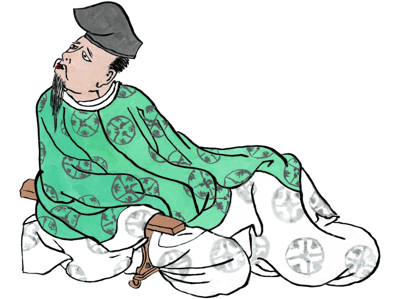
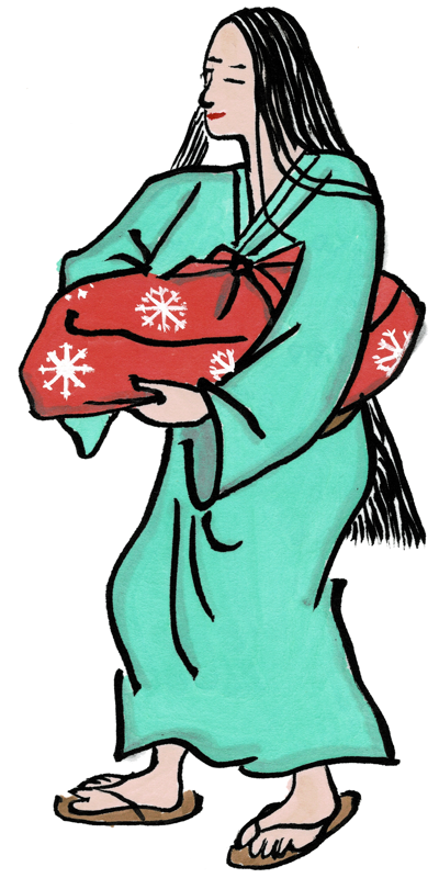
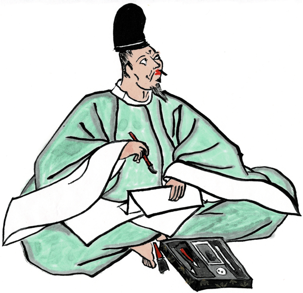
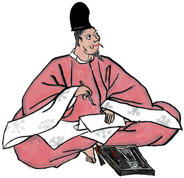
This is a copy of a portrait of Hitomaro, one of the most famous and revered poets of Japanese history. He is so revered, that he was eventually made a Kami (divinity) of poetry. Essentially, he is a Patron Saint of poetry.

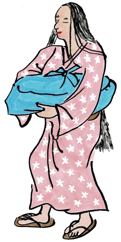
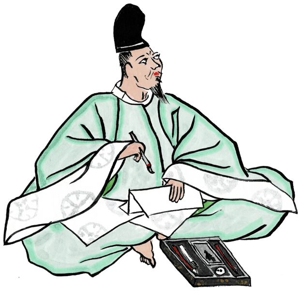
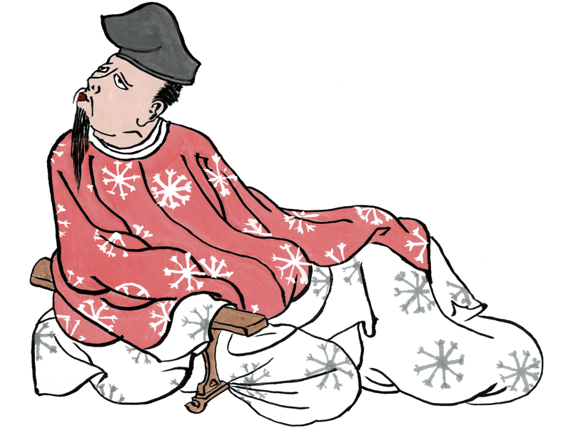
The above version was colored to match the original portrait I was imitating, which we saw in the Kyoto National Museum when we went to see the exhibition of panels from the Satake family version of the “36 Immortal Poets” scroll. I did a second copy of this image, but I colored his robe red for Aethelmearc and changed the “medallions” on the fabric to escarbuncles.

I have a third copy of the image that I did on larger calligraphy paper that I am attempting to mount as a kakejiku hanging scroll. Apparently it is the practice to hang a portrait of Hitomaro to oversee your poetic endeavors, so I wanted to have one of those handy for future use.

bookmark_borderMahogany Solar Flicker Lantern

I finished up the last of the six solar flicker lanterns today! The pieces for this one have been sitting on the workbench since before it got too cold to work out in the garage, so it’s a relief to be able to check this project off my list. Here it is hanging from the shourou:

This one is not just special because it’s the last one in the project, but because it is made from some mahogany that Sir Ogami Akira, the O-daimyo of Clan Yama Kaminari gave to me years ago from the surplus of his boat building supply. I’m pleased as punch to finally be able to do something with it, and to have that thing be for the Clan. I had just enough wood to make the lantern, though some of the sticks are a little thinner than specification. The construction is all mortise and tenon, with little 1/4″ tenons.

I also managed to get a picture of this one before the paper went on, to show you how the lighting unit just rests inside the rails on a couple of angled braces:

Here are links to the posts about the other five lanterns in this series: oak, maple, cherry, poplar, mulberry.

bookmark_borderDiseased Brushwork

The paintings are not actually diseased, of course. The original scroll is called the Yamai no Soshi emaki, which is “Scroll of Diseases and Afflictions”. This is a pretty unpleasant scroll overall, but there are some nice details. I particularly like this image of a calm maidservant carrying her mistress’ burden.

I’m clearly back into the swing of painting by now. The inking is smooth, the color is even, and the shading is good. I even put little escarbuncles on the package.

One of my favorite comic books is Usagi Yojimbo by Stan Sakai. Even when he’s working in black and white, he usually adds graphic interest to the clothing of characters by embellishing the fabric with repeating graphics. I decided to use this effect, adding little cherry blossoms to the maid’s kosode.

Here I added little ikat patterns to the kosode, and gave the package a tie-dye coloring. This started when some of the blue from the robe ran over into the wrapping cloth, then I tried to cover it up with some red, which just made it look like whatever was in the package was leaking blood. So, I had to do still more work.

This one got a reasonably smooth gradient coloring, made by mixing up some yellow paint, then adding orange, then adding red. I’m happy with how this turned out. The coloring is pretty smooth, too.

bookmark_border36 Immortals Brushwork

When Sharon and I went to Iga, Japan for the braiding conference in 2019, after the conference was over we spent a few days in Kyoto to see the sights. One of those days we walked over to the Kyoto National Museum. They were having an exhibition of most of the panels that used to be part of the Satake family version of the “36 Immortal Poets” scroll. this scroll was infamously broken up into individual hanging scrolls about a hundred years ago, and this was the most complete exhibition since that time.

Since I knew that eventually I would want to get back into scroll painting, I bought the book of the exhibit. This is first of my copies from this book, a portrait of Yamabe no Akihito. He is considered to be a poet only slightly less great than the famous Hitomaro.

This one is OK, but not great. The coloring is uneven and the shading is not very good. The original has terrific shading. I wish I’d thought about all the little details in his writing box (suzuribako) before I got started.

This one is much better. The coloring is almost completely even, and the shading is great. I even added the “medallions” to his hitoe underlayer that are visible in the original. Although, I seem to have forgotten the brush next to his foot.

This one I colored in red, and made the medallions into escarbuncles in honor of my home kingdom of Aethelmearc. The coloring and shading are good, and I like the way the escarbuncles came out.

bookmark_borderDesktop Castle Wall

How about a new desktop wallpaper image? This one is in high-resolution, so it should look nice on one of those 4K monitors if you have one.

Iga Ueno

This is one of the foundation castle walls of Iga Ueno Castle in Iga, Japan. Sweetie and I were in Iga for the Braid Society braiding conference, and on Wednesday afternoon we climbed the hill up to the castle and took a bunch of pictures. The sun was setting, and it lit the Western side of the castle beautifully.

bookmark_borderRedux of the Brushwork

When I started tracing emaki images for scroll blanks, the very first one I did was from the Eshi Zoshi emaki. This emaki recounts the rise and fall of a young poet appointed to the court. I decided to do some “back to the well” blanks as part of my current work, just to see if I’d gotten any better over time.

The outlines are good, but clearly, I had forgotten everything I ever learned about coloring this image. This one went straight into the “scrap” folder as soon as the paint was dry.

That’s better.

This one’s OK, although the skin tone came out a bit dark. I added some Hojo mon to the zabuton pillow for some reason.

Now I’m back in the swing of things! Good inking, good coloring, and I even added some light shading to give it a bit more dimensionality and texture. I’m pretty happy with this one.

bookmark_borderKoi Kosode

When I was in the fabric store to buy the flannel for the new pajamas, I took a browse through the selection of “Asian”-themed cotton prints, and found this colorful “koi in water” fabric. I don’t really need another kosode, but I need to make something out of this.

Cotton Koi Kosode

Here are some details that will mean nothing unless you are a kosode geek: The fabric was a little narrow, but I can still get away with wearing 14-inch wide panels, and I had gotten enough fabric to make it knee-length like I like them now. The sleeves are almost fully attached to the body, but I still like to give them a little flappy bit at the bottom. The sleeves themselves are about 18-inches tall, and the opening is half of that. It has a 3-layer neckband that is only about 2 inches wide.

Here is a close up of the fabric so that you might appreciate how pretty it is:

13 colors in that print

bookmark_borderReturn of the Brushwork

These three scroll blanks are traced from a frame captured from “The Tale of Princess Kaguya” a 2013 animated film Studio Ghibli. This film is beautiful, and has a large number of beautiful images in it.

This modern animated film is based on an anonymous 10th-century folk tale called “Tale of the Bamboo Cutter”. It follows the life of a mysterious baby girl who is found in a shining bamboo stump and raised to be a princess by a poor childless couple.

For almost a decade following its release, this was the most expensive Japanese film ever produced, possibly due to the art style that is based on the Yamato-e style of old Japanese illustrated scrolls (emaki). In 1999, director Takahata published a book called “From a Painting” in which he explored traditional Japanese art and its ties to his animation.

In this image, the devoted maidservants of the Princess ready her cart for travel.

This one, I think I laid the color on a bit heavy. It’s vibrant as heck, but you can’t tell that the maid’s gowns are four different colors.

This one’s a bit lighter, but still too heavy. I tried a different green on the cart, and embellished it with bamboo leaves the way it is in the film, though.

This one is so much lighter, and you can really see the different hues on the robes. I’m starting to get the hang of using really watery mixes of paint to wash color into the paper. The paper is super-absorbent, so you need a light touch to keep from creating blobs of color. Super happy with this one.