bookmark_borderHere’s That Pelican Brushwork

Here we go with that first pelican image I was talking about last week. I did four copies of this one. The first one is quite large, occupying most of a sheet of 9″x12″ paper.

Pelican 01 01

The others are smaller, to leave more room on the page for writing.

Pelican 01 03
Pelican 01 04

This last one I rotated a bit to make it occupy even less of the page.

Pelican 01 02

Traced from “Pelikan” by Christoph Schaarschmidt (2021). This photo was one of the top 50 photos in the CEWE photo awards competition of 2021. I saw this photograph of a pelican, and just thought it would make a good writ scroll or other recognition of service. The dignity of this noble bird shows through, as does the dignity of those who perform service in the society. I traced the photo and colored it in the “tsukuri-e” (built up paint) style.

bookmark_borderStamp Card

At the Tokyo Japanese Store here in Pittsburgh, where I get most of my Japanese groceries, they give you a stamp on your stamp card for every ten dollars in merchandise you buy. When you get 50 stamps, it’s a $10 coupon for the store. That’s only a 2% rebate on groceries, but everybody knows the real value comes from collecting the cute little stamps they use. They change them out every week, and must have a huge box full of hundreds of them at home. Here’s one I completed earlier this year, but did not want to use until I got a scan of it.

Stamp Card

Please don’t use this image to get $10 off Japanese groceries.

bookmark_borderMore Pelican Brushwork

I just realized that I never posted about the first set of pelican brushwork, but here is the second set of pelican images. The story here is that the “Order of the Pelican” is the SCA peerage order, much like a Knighthood is for fighting, but for service to the society. I saw a terrific photograph of a pelican in a page about “best wildlife photographs of 2021”, and I realized that the image would make a great Yamato-e scroll blank. Maybe not for a peerage, but maybe for a “writ”, an invitation to consider entry into the order. I thought that image came out OK, but I hunted down another image because I wanted one in flight …and here it is!

Pelican 02 01
Pelican 02 02
Pelican 02 03

My paintings are derived from a photograph posted to Awesome Sasquatch in 2013 by Ken Chan. All credit, any vibrancy and splendor in my image is entirely based on his image.

bookmark_borderStorage Box for Stickers

Over the past few years, I’ve had a number of custom vinyl stickers made by StickerGuy.com. If you get on their mailing list, they send email every couple of months about specials, and for smaller stickers the price for a minimum order of stickers is usually less than $30. It’s kind of an extravagance, but sometimes the monthly special is for a set of colors that are useful for some SCA heraldry or other shenanigan. Anyway, having all these banded bundles of stickers around is starting to get annoying, so I built a box to organize them.

Box for 2.75″ stickers

I still have some thin wood scants left over from long-ago projects, so it was a pretty simple thing to split some to size and glue up a little box. The interior of the box is 12 inches long, 2.8125 inches wide, and 2 inches deep. There are no fasteners or fancy joinery. This box won’t see much abuse, so I’m hoping glued butt joints will be sufficient. The wood is kind of special, I guess. The label said it was mahogany. I think it was intended for the dollhouse building boom of the 1990s.As you can see, this box is nearly full, so I may need to make another one some time.

bookmark_borderBanner for Illadore

A good friend of ours, Mistress Master Baroness Illadore de Bedegrayne, was being elevated to to Order of the Pelican in the SCA, so I decided she needed a new banner to display during her pre-elevation vigil (which was not really a vigil, but there was a tent, so banners were needed).

Banner for Illadore de Bedegrayne

This banner was made with acrylic fabric paints on blue linen. The unicorn rampant in the center was one of the more difficult charges I have painted, and the repeating fleur-de-lis border was challenging.

Stencils

I printed out a stencil for the Unicorn. That helped me to get the outline and fill that in with white paint. Then, I cut the stencil apart to help me get the internal lines of the design in the right places.

Stamp

I made a stencil for the fleurs-de-lis, too (you can see it in the “Stencils” photo), but it turned out to not work so well with the dauber, due to how non-flat the fabric is after painting with the white base coat. I wound up cutting a small stamp from some craft foam, and that worked great. I still needed the daubers that I bought. One became the handle for the stamp, and the other was used to apply a nice coat of paint to the stamp for transfer to the banner. This work so much better than the stencil that I will certainly use this technique again for the annoying repeating patterns that Europeans seem to be enamored of.

bookmark_borderNew A&S Minister Banner

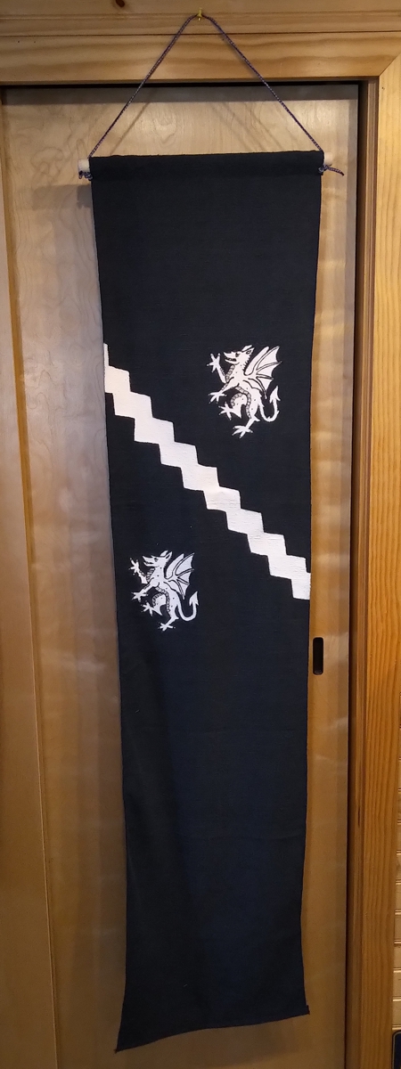
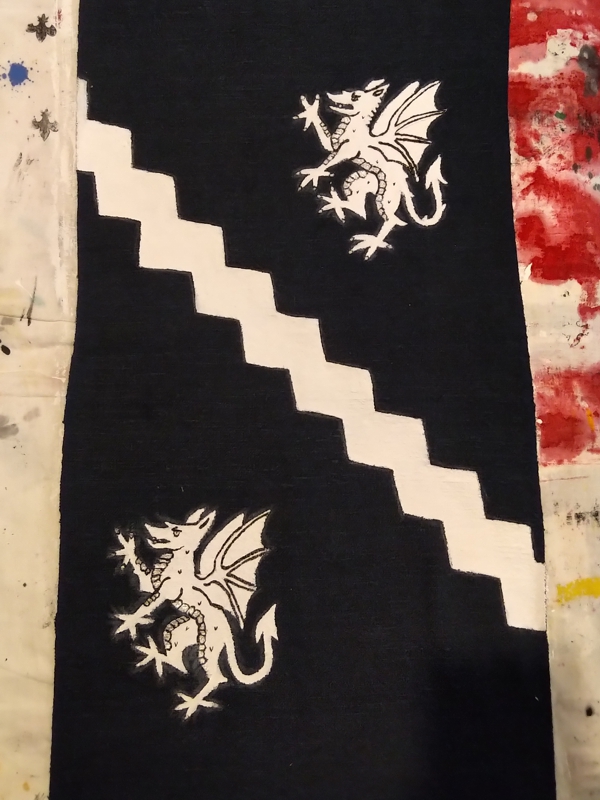
Back in February, I was elected the new Baronial Minister of Arts and Sciences. I decided that this office needed a new banner to display at events, so I made one.

BMDL A&S Banner

This hata-jirushi style banner is made with acrylic fabric paints on navy blue linen. I’m not super happy with the way the comet came out, but I think the A&S badge is perfect. I should get some glow-in-the-dark paint to do the candle flame and the comet. That would look awesome, I think.

bookmark_borderBook Review – “Once Upon a Time In Hollywood”

I’m a great big slobbering fan of Quentin Tarantino’s films, so when I saw that he had released a “novelization” of his most recent film, “Once Upon a Time… In Hollywood” I added it to my shopping list.

Cover image courtesy of alibris.com

I greatly enjoyed reading this book, but one thing you need to know about it is that it is not the same story as the film. First of all, since it is a book there is a lot more of the story told from inside the heads of the characters. You see the world through their eyes and histories, rather than through your eyes and Tarantino’s camera. There are long expository sequences recounting the history of cinema and television, as regarded by different characters. These sequences inform the actions of the characters, but this exposition is not present in the film.

Actually, the book is edited so that the entire “point” of the story is different. If you utilize my theory that a well-crafted story ends on the point, then the end of the movie indicates that what Rick Dalton really wants to be is a real hero (like his friend Cliff Booth is), but the end of the book indicates that what Rick Dalton really wants to be is a real actor. This is a big difference.

Some of the Charlie Manson stuff from the movie is present in the book, but much of it has been edited out. Rick Dalton even makes some different choices in the book than he does in the movie, or at least that is what is implied. Anyway, the book is different than the film. I enjoyed both, but they are not exactly the same. I wonder if the book is the movie that Tarantino kind of wishes he could have released, but the movie is the movie that he knew he had to release to avoid bad reviews. Maybe Tarantino is just making fun of the way that novelizations are almost always different from the films.

The design of the book is really cool, mimicking the design of movie novelizations from the sixties. There are even ads for sixties books and movies in the back. I wish there was an ad for Red Apple cigarettes. I have so many old SF paperbacks with cigarette ads in them.

bookmark_borderTie-Dye T-Shirts

A few weeks ago, we visited some of the sweetie’s relatives, and she did a big batch of tie-dyeing as an activity with the nephews. We tried out all kinds of different techniques from the Dharma tie-dyeing guide and made a huge mess. Here are the two that I made for myself.

My Favorite

For this one, I crumple-pleated it along the vertical axis, then bound it up using rubber bands. Then, I squirted dye all over each horizontal band with the squeeze bottle. These are heavy-weight 100% cotton shirts, so the dye took really well. I really like how the crumples continue across the bands, and I like how organic the shapes are.

The Other One

This one is nice enough, I suppose, but I just don’t think I got enough dye in it.

bookmark_borderOne Year of the Shourou

I assembled the bell tower back in August of last year, and finished up working on it in September. Since then, it has survived snowstorms, rainstorms, windstorms, cold, heat, and everything. It has made my sweetie’s front garden even prettier for a full year!

Here it is, surviving yet another deluge